Archive for January 2013

Chess Poster

As a temporary break from cocktails, I thought I might post another of my recent creative endeavors, the creation of a poster for a local production of the musical Chess (for those not into the whole scene, it was the one written by the guys from Abba back in the 80’s that included the radio hit “One Night in Bangkok”). And it serves as a lesson to me in how to handle projects like this in the future, as you will see.

So, to begin, the musical has a backdrop of international chess competitions, and, taking place during the Cold War, it focuses on a rivalry between the US and the USSR. There’s espionage and a love story between a Russian defector and an American woman who serves as second to the American competitor. It’s all a bit convoluted, and the book is a bit of a mess, but the music is pretty catchy even if the lyrics are somewhat clunky and heavy-handed to my ear.

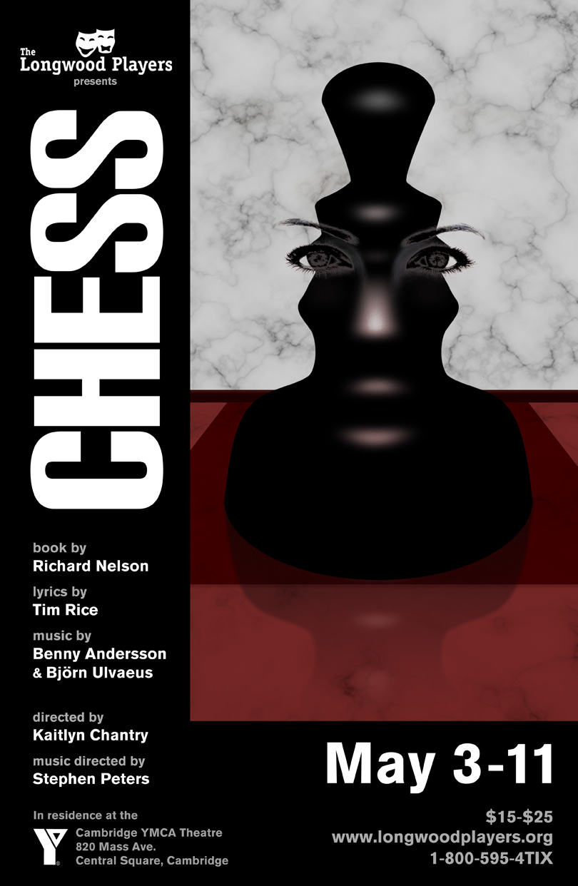
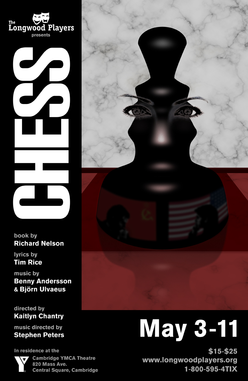
I knew that I wanted some central chess image, and you’ve got either a checkerboard or a chess pieces, really. The original concept used a checkerboard falling apart, which I quite like, and the Broadway had two people running in front of flags without any hint of chess, which I don’t like at all. I thought I might create a chess piece that would create an optical illusion in the empty space of the two competitors facing off. Once I had done this, I was surprised to find that the highlights on the chess piece implied a second illusion of a face. I went further with this and created a woman’s face that was between two competing men, which I thought captured the triangle in the musical.

poster

After getting approval to move forward with this concept, I added a chess board below the piece and wanted to texture this with marble, which mimicked a chess board I had when growing up. During that process, I threw the marble behind the piece as well since the empty space was bothering me a bit. At that point I discovered that I could place the texture in such a way as to imply faces for the silhouetted figures, which I thought was a nice, subtle touch. After that it was just about getting all the words on to the poster, the greatest challenge for me, generally.

chess_poster_marble

To quote Fantine, “And then it all went wrong.” Unfortunately, although I really liked it, this wasn’t the direction the creative team wanted to go. To them, there was no relationship triangle in the show and their production would be focused on the espionage and the US vs. USSR, something I hadn’t been told at the beginning of the process. They were quite right that this poster didn’t promote that idea. I was very proud of the result, but it wasn’t right. They also didn’t like the marble and instead wanted something that showed the political angle. And then I made a mistake.

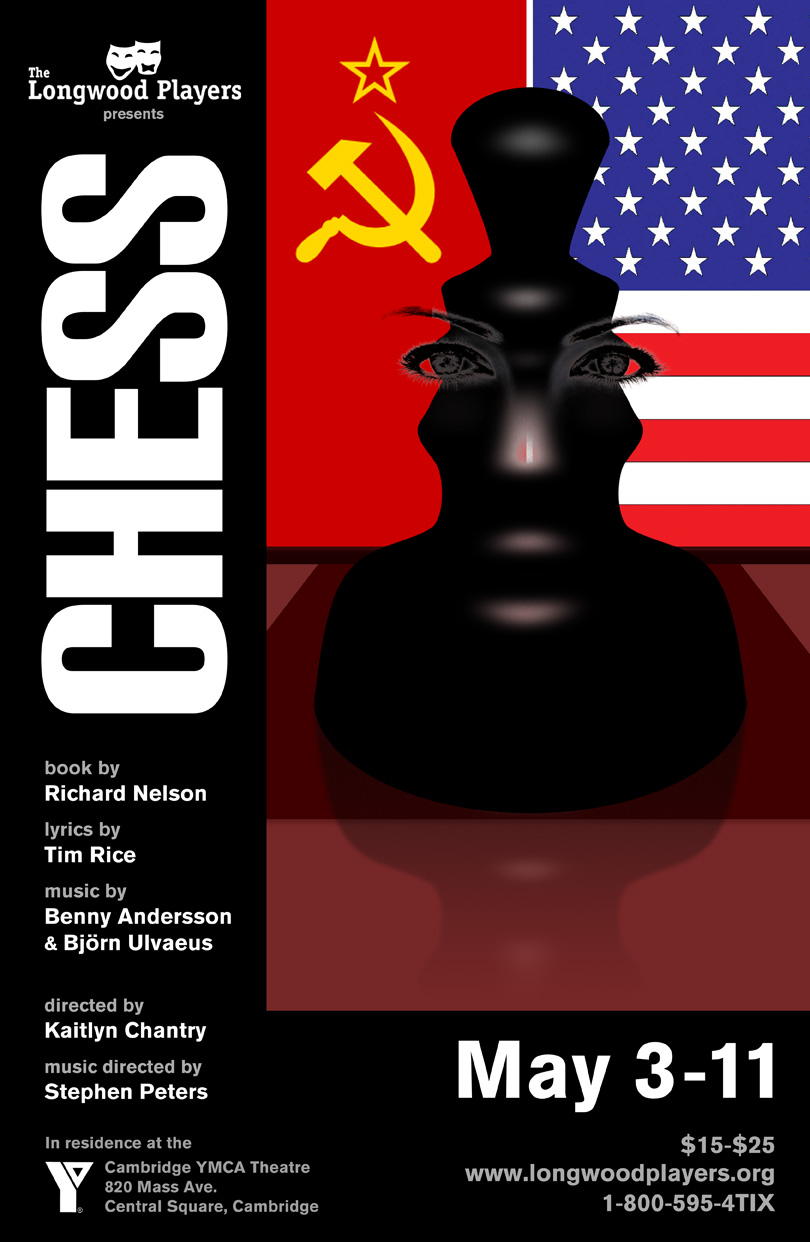
To show that filling the silhouetted space with something like flags would not only ruin the illusion, but also be a little too much hitting the nail on the head with a sledgehammer in a poster with too many ideas, I threw the following together. I thought it would be quickly dismissed and that I could move forward with the poster I liked.

chess_poster_flags

You can probably see where this is going.

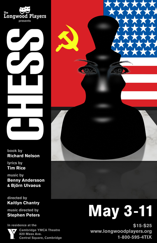
They loved it. I offered to try something else to get the political angle in without destroying the initial concept. I didn’t love this either, but felt it was a better option at least.

chess_poster_reflection

Nope, no good. They felt this was too many ideas, which I completely agreed with (I think I might have said it first), that somehow the flags in the background avoided, which I didn’t agree with. So in the end, since it is their production and not mine, and it needs to express what they want it to express, I cleaned up the flags in the background and gave them this.

chess_poster_final

I do believe it has too many ideas crammed into it and the illusions of both the silhouettes and the woman’s face are a bit lost (and, when not lost, looks like they have hats, as my wife commented), and if I could approach it from scratch I would do it completely differently, but with deadlines looming and my time extremely limited (I also volunteer for this — it is not a paid gig) we had to move forward with this, a piece I am wholly unsatisfied with, which is frustrating since I was so happy with the original product.

Lessons to me are never to proceed with anything unless I get very clear instructions on what is desired from all parties involved, even if deadlines are approaching. And, more importantly, never submit something that I know I do not like. This was my fault and completely backfired in this case. I knew I hated the flags. I assumed everyone would hate the flags. I never should have mocked it up.

Lesson learned. Now it’s time to make a drink.

Emerald Green

emeraldGreen

Now we start getting into the odder colors in our Cocktails in the Park with George palette. We’ve left the cozy confines of the reds, oranges and yellows and now veer left at the Land of Oz to emerald green (hex value #50C878).

Emerald Green

  • 1.0 oz. Akvavit (Aalborg)
  • 1.0 oz. Midori
  • 0.5 oz. Thatcher’s Cucumber liqueur
  • 0.25 oz. lime juice
  • 1 barspoon green Creme de Menthe

Shake with ice and strain into cocktail glass.

I just had to break out the Midori and the Creme de Menthe for this one, these being two dusty bottles I probably purchased in my first round of mixer buying years ago since a) they were cheap and b) with my limited knowledge of cocktails at the time these were two I had actually heard of before. However, after mixing a Melonball and a Grasshopper (I know..) there was not much else I could find for these and they got relegated to a forgotten corner of my bar. Until now.

Since I was starting with melon as a base, to which I knew I was going to add a bit of mint, I needed a flavor to complement this bit of a farmer’s market and I thought Akvavit would work nicely with its caraway and anise undertones. I chose the clear, unaged Aalborg from Denmark to help keep the green cast of the finished cocktail. For an additional bit of sweetness I added the cucumber liqueur, though its taste is so subtle against the bolder flavors that it comes off as a lighter simple syrup. Then, for a bit of brightness and tartness I added the lime juice, which didn’t detract from the color (let’s face it, the Midori is almost radioactive in appearance and obliterates most of the other colors anyway).

Even just a little creme de menthe can take over a drink, so a barspoon is all that’s needed here, which still makes its presence known in the final drink. At the time I made the drink I used a cheap mixer I will probably never empty, but since then I have spotted the new offering from Tempus Fugit. As their new creme de cacao is so phenomenal, I am curious to know whether their creme de menthe is as eye opening. Who knows, perhaps a bottle of that could come out from the forgotten corners of the bar and play a bigger part in future cocktails?

The Kilted Heir

Mixology Monday

This month’s Mixology Monday theme, as presented by Chemistry of the Cocktail, is Fortified Wines, and so I took a break from the Island of La Gande Jatte to throw my own libation into the mix. From the announcement:

Fortified wines began, in large part, as a way to deal with the difficulties of shipping wine long distances in the holds of sailing ships. Without the rigorous sterilization that is possible today, wines would often spoil en route. However, increasing the alcohol concentration to around 20% ABV was enough to keep them from going off. Coincidentally, this also made it possible to age those wines for very long periods, increasing their richness and depth.

Now, I use fortified wines all the time in the form of the many variations of vermouth, but for this challenge I wanted to go with an ingredient that I didn’t normally use (and vermouth has had its own Mixology Monday in the past). It so happened that I had a bottle of Madeira that I was saving for cocktail exploration at some point so this was a great opportunity to open it up. Generally I don’t use things like Port, Madeira or Sherry just because they, like vermouths and other fortified wines, require you use them within a short amount of time before they turn. Yes, they do keep a while — that was the whole point — but they don’t keep for months and months (please don’t leave vermouth out in your bar for a year; throw it out, I beg you). I only have so much room in my refrigerator I can use before my wife files divorce papers, so I have gone with the more easily mixed vermouths than with something like Madeira.

But here I knew I was going to be trying a lot of experimenting and would probably quickly go through the bottle. This was certainly the case as in the end I went through so many variants before arriving at my submission for the month, The Kilted Heir:

kiltedHeir

The Kilted Heir

  • 1.5 oz. Madeira
  • 1.0 oz. blended Scotch
  • 0.5 oz. Amaro Nonino
  • 2 dashes Angostura bitters

Stir with ice and strain into coupe.
Garnish with an orange twist and 3 drops of salt water.

Madeira offers a spicy nuttiness that I thought paired well with a blended Scotch (I used Famous Grouse) and the sweet nuttiness of Amaro Nonino. There’s a spiciness to Angostura as well, so this added to the depth and the bitter note pulled everything together for me. The orange garnish added nicely to the nose of the cocktail, and the salt water was a last minute addition I made after the first couple of sips. I felt it brought out the spices all the more.

The name derives first, probably obviously, from the Scotch component. The “Heir” is a hat tip to Henry the Navigator, the man who discovered the Madeira Islands, who was Infante (great name for a cocktail, but, alas, already taken), or heir to the king. Or at least Wikipedia tells me so.

I did have quite a few other attempts at pulling Maderia into a drink, most admittedly not successful. I found that either the Madeira didn’t play well with other flavors, or else I masked it so much that it defeated the purpose. I felt The Kilted Heir did a fine job of highlighting the Madeira while still creating a unified drink. Some others that I did enjoy I list here for sake of recordkeeping.

Fronkensteen

  • 1.0 oz. Madeira
  • 1.0 oz. sweet vermouth (Torino Vermouth de Torino)
  • 1.0 oz. Old Monk rum
  • 1.0 oz. Cynar

Stir with ice and strain into coupe.
Garnish with an orange twist.

Basically a Negroni using Old Monk and Cynar, with Madeira added into the mix. The Old Monk, one of my favorite bases to mix with, could hold its own against the Madeira with its spiciness. It was good, but not terribly original, which is why I did not feature it. The name obviously comes from the pronunciation in the Mel Brooks movie Young Frankenstein, the musical adaptation of which I was just cast in when I made the drink. Can’t wait to get started on those themed drinks!

Forte Without the Ay

  • 1.0 oz. Cognac
  • 1.0 oz. Madeira
  • 0.5 oz. Averna
  • 2 dashes orange bitters

Stir with ice and strain into coupe.
Garnish with an orange twist.

This was a minor variation of The Kilted Heir. I wanted to try a Cognac base instead. Another drinkable concoction, but I felt the Scotch base led to a more robust drink.

The name comes from a little peeve of mine concerning the pronunciation of “forte.” It’s pedantic, so forgive me, but we all have our little quirks, don’t we? When someone says, “That’s my forte,” most often they give it two syllables as in the Italian pronunciation. However, that’s an Italian musical term that means loud. “Forte” meaning “strong point” has a different, French etymology and should be pronounced as the English “fort.”

Of course, words and the English language change all the time (as my wife and I argue “sneaked” and “snuck”), and that is as it should, so I realize it is a rather silly argument I make. In fact, the online Merriam-Webster dictionary has this to say:

In forte we have a word derived from French that in its “strong point” sense has no entirely satisfactory pronunciation. Usage writers have denigrated \ˈfȯr-ˌtā\ and \ˈfȯr-tē\ because they reflect the influence of the Italian-derived forte. Their recommended pronunciation \ˈfȯrt\, however, does not exactly reflect French either: the French would write the word le fort and would pronounce it more similar to English for. So you can take your choice, knowing that someone somewhere will dislike whichever variant you choose.

Ah, c’est la vie (pronounced “kest la vye”).

Viridian

viridian

By far the prettiest of the Cocktails in the Park with George colors/drinks to my eyes, the Viridian cocktail moves from the oranges and yellows of the previous lot into cool blues and greens (without the Windex blue we will see shortly), with a hex value of #40826D and some cool ingredients as well.

Viridian

  • 2.0 oz. Magellan gin
  • 0.5 oz. Maraschino liqueur
  • 0.25 oz. Green Chartreuse
  • 4 dashes acid phosphate
  • 4 drops salt water

Stir with ice and strain into cocktail glass.

Magellan is a French brand whose gin offering has a unique blue hue from the infusion of iris flowers. It’s subtle, but a neat effect, and serves as the perfect base for this drink. You might notice that most of the other ingredients are found (along with gin) in the immaculate Last Word cocktail. The Green Chartreuse added the necessary green tint to the drink, and from that point I didn’t see much reason to stray from the Last Word’s path, adding in the Maraschino for its sweetness.

However, lime juice from the Last Word set the color off too much from my desired end result so I turned instead to some dashes of acid phosphate, an ingredient once widely found in soda fountains that I will admit I picked up as a lark and hadn’t yet utilized much. Here, though, it added a nice bit of tartness without affecting the color in any way.

The salt water? Dunno. Felt like it needed it. Sometimes I don’t have a reason beyond that.

Chrome Yellow

chromeYellow
So at this point in my Sunday in the Park cocktails I realized I was getting to the end of my friendly oranges and yellows and I hadn’t yet used a nice aged whiskey. I had utilized a silver whiskey for my first drink, the Vermillion, but hadn’t gone with a whiskey with any color, which I knew wouldn’t be possible once I moved into blues and greens. So I turned to bourbon for the basis of my sour variation, the Chrome Yellow (let’s say something like #FCDE28 though I was going for more of something you would see on a school bus).

Chrome Yellow

  • 1.5 oz. Bourbon
  • 0.5 oz. Gran Classico
  • 0.5 oz. St. Germain
  • 0.25 oz. lemon juice

Shake with ice and strain into cocktail glass.
Twist lemon peel over glass and discard.

I am not the biggest fan of lemon juice, as I have written, but there was enough sweetness here to counter it for me. The Gran Classico added a bitterness to the sweetness from the floral St. Germain (in addition to its own sweetness and what you get from the bourbon). It also added just the right color, which, you know, is sort of the theme here.

Interestingly to me, chrome yellow was an unfortunate choice for Seurat (and others). It oxidizes and dulls over time and a fair bit of brilliance in the original La Grande Jatte painting is gone because of it, replaced by muddier browns where the more vibrant chrome yellow once was.

That’s a lesson to everyone to fresh squeeze their lemons for their drinks. I think. I’m not good at extracting morals.