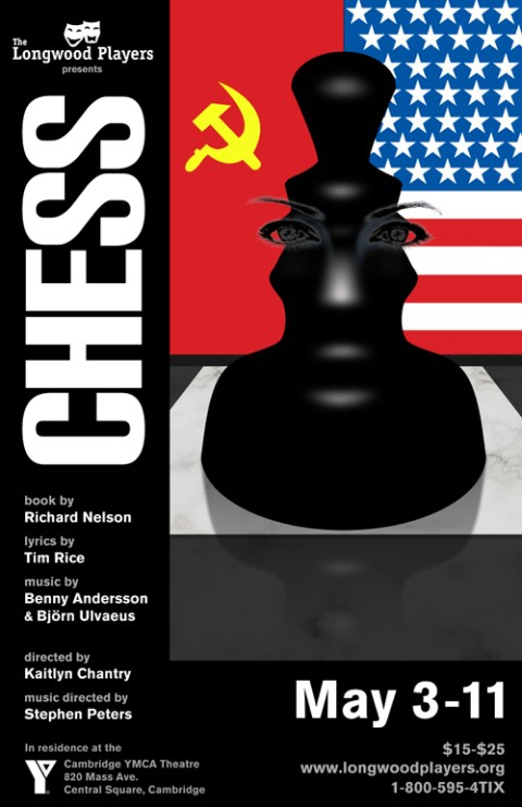
As a temporary break from cocktails, I thought I might post another of my recent creative endeavors, the creation of a poster for a local production of the musical Chess (for those not into the whole scene, it was the one written by the guys from Abba back in the 80’s that included the radio hit “One Night in Bangkok”). And it serves as a lesson to me in how to handle projects like this in the future, as you will see.
So, to begin, the musical has a backdrop of international chess competitions, and, taking place during the Cold War, it focuses on a rivalry between the US and the USSR. There’s espionage and a love story between a Russian defector and an American woman who serves as second to the American competitor. It’s all a bit convoluted, and the book is a bit of a mess, but the music is pretty catchy even if the lyrics are somewhat clunky and heavy-handed to my ear.
I knew that I wanted some central chess image, and you’ve got either a checkerboard or a chess pieces, really. The original concept used a checkerboard falling apart, which I quite like, and the Broadway had two people running in front of flags without any hint of chess, which I don’t like at all. I thought I might create a chess piece that would create an optical illusion in the empty space of the two competitors facing off. Once I had done this, I was surprised to find that the highlights on the chess piece implied a second illusion of a face. I went further with this and created a woman’s face that was between two competing men, which I thought captured the triangle in the musical.
After getting approval to move forward with this concept, I added a chess board below the piece and wanted to texture this with marble, which mimicked a chess board I had when growing up. During that process, I threw the marble behind the piece as well since the empty space was bothering me a bit. At that point I discovered that I could place the texture in such a way as to imply faces for the silhouetted figures, which I thought was a nice, subtle touch. After that it was just about getting all the words on to the poster, the greatest challenge for me, generally.
To quote Fantine, “And then it all went wrong.” Unfortunately, although I really liked it, this wasn’t the direction the creative team wanted to go. To them, there was no relationship triangle in the show and their production would be focused on the espionage and the US vs. USSR, something I hadn’t been told at the beginning of the process. They were quite right that this poster didn’t promote that idea. I was very proud of the result, but it wasn’t right. They also didn’t like the marble and instead wanted something that showed the political angle. And then I made a mistake.
To show that filling the silhouetted space with something like flags would not only ruin the illusion, but also be a little too much hitting the nail on the head with a sledgehammer in a poster with too many ideas, I threw the following together. I thought it would be quickly dismissed and that I could move forward with the poster I liked.
You can probably see where this is going.
They loved it. I offered to try something else to get the political angle in without destroying the initial concept. I didn’t love this either, but felt it was a better option at least.
Nope, no good. They felt this was too many ideas, which I completely agreed with (I think I might have said it first), that somehow the flags in the background avoided, which I didn’t agree with. So in the end, since it is their production and not mine, and it needs to express what they want it to express, I cleaned up the flags in the background and gave them this.
I do believe it has too many ideas crammed into it and the illusions of both the silhouettes and the woman’s face are a bit lost (and, when not lost, looks like they have hats, as my wife commented), and if I could approach it from scratch I would do it completely differently, but with deadlines looming and my time extremely limited (I also volunteer for this — it is not a paid gig) we had to move forward with this, a piece I am wholly unsatisfied with, which is frustrating since I was so happy with the original product.
Lessons to me are never to proceed with anything unless I get very clear instructions on what is desired from all parties involved, even if deadlines are approaching. And, more importantly, never submit something that I know I do not like. This was my fault and completely backfired in this case. I knew I hated the flags. I assumed everyone would hate the flags. I never should have mocked it up.
Lesson learned. Now it’s time to make a drink.


[…] moved to this designer without my knowledge, perhaps after the unfortunate situation surrounding my Chess poster). I had to put this together over a weekend to help them out. The result was the […]